PANTONE COLOUR OF THE YEAR 2018
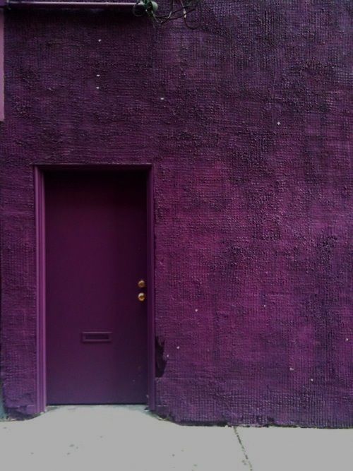
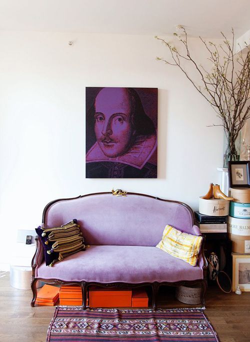
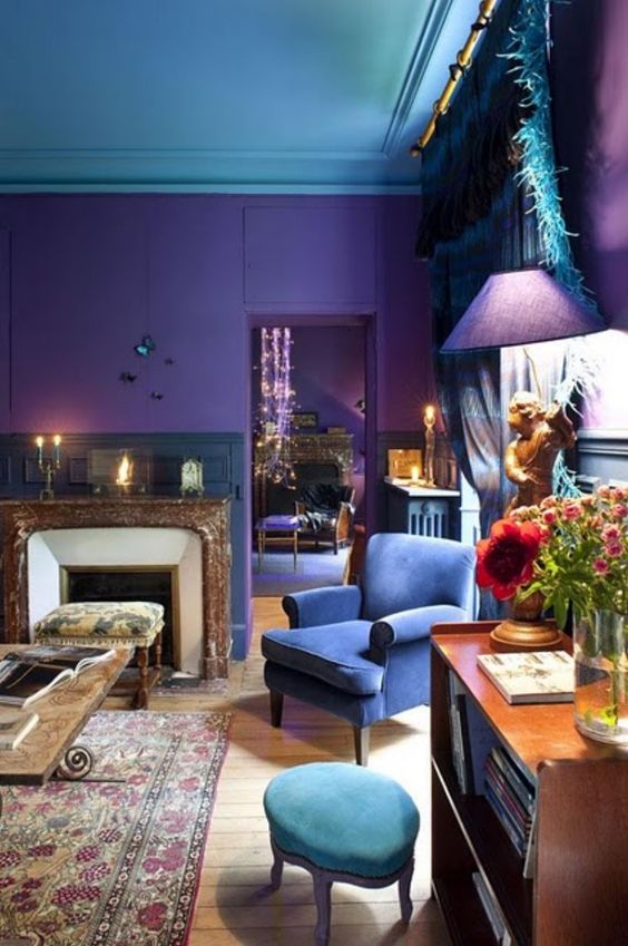
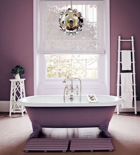
So colour guru's Pantone have announced the colour for 2018, Ultra Violet! When I first heard I wasn't too impressed. Going from lovely green's in 2017, I felt Ultra Violet was a little bit of a let down. I just had images of an outdated purple room, with all it's walls painted in the colour, making the accessories hard to buy. What goes with purple? After a little bit of research it became apparent that purple needn't be the wall colour to make a statement. Accessories is the key to this vivid Cadbury colour and can be paired with similar vivid colours such as emerald green and solid pinks. Keeping the dark tones continuous throughout the palette.
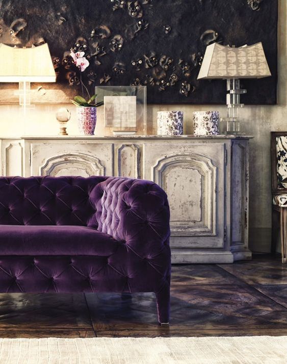
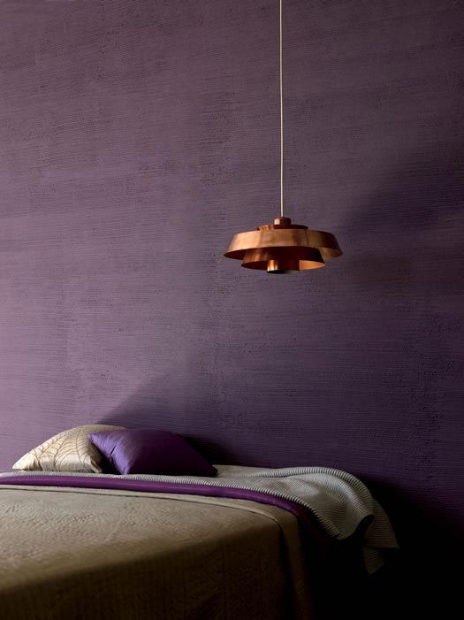
Pomp and Power tones combined with Byzantium, dark rich shades would compliment this light Ultra Violet tone.
I'm sure throughout 2018 there will be more inspiration flowing through magazines and feeds, but for now I am still undecided on Ultra Violet.
Pomp and Power tones combined with Byzantium, dark rich shades would compliment this light Ultra Violet tone.
I'm sure throughout 2018 there will be more inspiration flowing through magazines and feeds, but for now I am still undecided on Ultra Violet.
www.theleoisallinthemind.tumblr.com
www.firstsenseinteriors.co.uk
|
www.dorisleslieblau.com
www.bijouandboheme.blogspot.co.uk
|
www.usualhouse.com
www.i.pinimg.com
|
www.drummonds-uk.com
Violet was a prominent colour through the Impressionist Movement, where it was thought that shadows in scenes weren't black or grey, but coloured. The complimentary colour to Yellow is Violet and so it made sense that Violet would be the colour of shade.
("The Secret Lives of Colour" by Kassia St Clair) 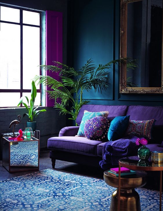
www.deardesigner.co.uk
|
